A pie chart is a circular graph used to show how different categories contribute to a complete dataset. Each category is represented by a slice of the circle, with the size of the slice corresponding to its proportion or percentage of the whole. This simple visual format makes it easy to understand how individual parts compare with the total.
Pie charts are commonly used in education, business, statistics, reports, presentations, and data analysis. They can quickly show which category represents the largest share, which categories are smaller, and how the parts relate to one another.
When a dataset contains a limited number of meaningful categories that make up one complete whole, a pie chart can provide a straightforward way to communicate the information visually.
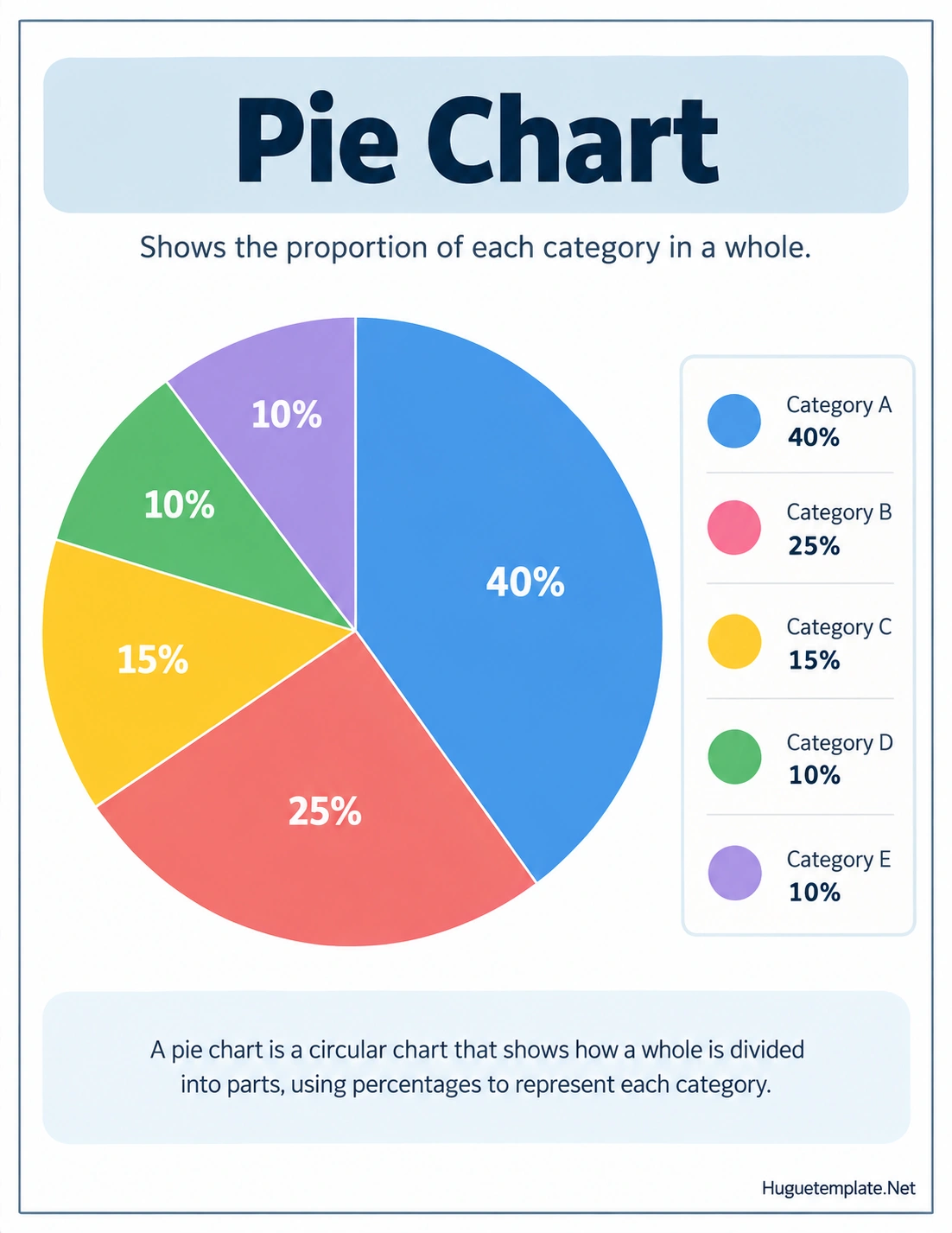
What Is a Pie Chart?
A pie chart is a circular data visualization divided into sections called slices or sectors. Each slice represents one category in a dataset, and the size of each slice shows that category’s share of the total.
The complete circle represents 100 percent of the data. Therefore, all slices together must equal the entire dataset. If one category accounts for 40 percent, its slice occupies 40 percent of the circle.
This makes a pie chart particularly useful when the main goal is to show a part-to-whole relationship. Instead of comparing numbers in a table, readers can quickly see how much of the total belongs to each category.
How Does a Pie Chart Work?
A pie chart converts numerical values into proportional sections of a circle. The larger the value, the larger the corresponding slice.
For example, imagine a survey of 100 people about their favorite fruit. If 40 people choose apples, 25 choose bananas, 15 choose oranges, 10 choose grapes, and 10 choose strawberries, the pie chart can represent those results as 40%, 25%, 15%, 10%, and 10%.
The entire circle represents all 100 responses. Each slice represents one fruit category and its percentage of the total.
The Circle Represents the Whole
The complete circle represents 100 percent of the dataset. This is the foundation of a pie chart because every category must represent part of that same whole.
Each Slice Represents a Category
Every section of the chart corresponds to one category. The category names can be displayed directly on the slices or listed in a legend.
The Slice Size Represents the Proportion
A larger slice indicates a larger proportion of the total. A smaller slice indicates a smaller contribution. This allows readers to compare relative shares without calculating every value themselves.
How to Calculate Pie Chart Percentages
To create an accurate pie chart, you first need to determine what percentage of the total belongs to each category.
The basic formula is:
Percentage = (Category Value ÷ Total Value) × 100
For example, suppose a store sells 200 products in one week and 50 of those products are notebooks. The notebook percentage is calculated as:
(50 ÷ 200) × 100 = 25%
Therefore, notebooks would represent 25 percent of the pie chart.
You can use the same calculation for every category. When the calculations are correct, the percentages should add up to 100 percent, allowing for minor rounding differences.
How to Calculate Pie Chart Angles
When drawing a pie chart manually, percentages can also be converted into angles. A complete circle contains 360 degrees, so each percentage corresponds to a proportional angle.
The formula is:
Angle = (Category Value ÷ Total Value) × 360°
For example, a category representing 25 percent of the total would have an angle of:
25% × 360° = 90°
This means the category would occupy a 90-degree section of the circle.
How to Read a Pie Chart
Reading a pie chart involves identifying the categories, examining the relative size of each slice, and interpreting the percentages or values provided.
Follow these steps when analyzing a pie chart:
- Identify the topic: Read the chart title to understand what the data represents.
- Check the categories: Look at the labels or legend to identify each slice.
- Read the percentages: Use the displayed percentages when available.
- Compare slice sizes: Determine which categories have the largest and smallest portions.
- Consider the whole: Remember that the entire circle represents 100 percent.
- Draw conclusions: Use the visual comparison to identify important patterns or differences.
What Is a Pie Chart Used For?
A pie chart is useful when the goal is to show how individual categories contribute to one complete total. It can make proportional data easier to understand than a long list of numbers.
Common applications include:
- Survey results: Show how respondents are distributed among different choices.
- Business reports: Display sales shares, customer segments, or market categories.
- Budget analysis: Show how a total budget is divided among spending categories.
- Education: Help students learn percentages, fractions, ratios, and data interpretation.
- Marketing: Illustrate audience segments or traffic sources.
- Research: Present categorical results in a visually accessible format.
- Presentations: Summarize proportional information in a compact visual.
Advantages of Using a Pie Chart
One of the biggest advantages of a pie chart is its visual simplicity. Readers can often identify the largest and smallest categories almost immediately.
Easy to Understand
Because the chart uses familiar circular sections, basic proportions can often be understood without extensive statistical knowledge.
Shows Part-to-Whole Relationships
A pie chart clearly communicates how individual categories contribute to a complete dataset. This is particularly useful when percentages are more important than exact numerical values.
Highlights Major Categories
A large slice stands out visually. This can help readers quickly identify the category with the greatest contribution.
Useful for Simple Presentations
A well-designed pie chart can summarize a relatively small dataset without requiring a large table or lengthy explanation.
Limitations of Pie Charts
Although pie charts are useful, they are not appropriate for every type of data. Understanding their limitations can help you choose the right visualization.
- Too many categories: A chart with many small slices can become difficult to read.
- Similar percentages: Slices with nearly identical sizes can be difficult to compare visually.
- Negative values: Pie charts are generally unsuitable for datasets containing negative values.
- Changing data: They are less effective when comparing changes across multiple time periods.
- Exact comparisons: A bar chart may make it easier to compare similar values precisely.
- Incomplete totals: A pie chart requires categories that collectively represent a meaningful whole.
Pie Chart vs. Bar Chart
Both pie charts and bar charts can display categorical data, but they serve different visual purposes.
A pie chart is generally best when you want to emphasize the relationship between individual categories and one complete total. A bar chart is often better when you need to compare the exact size of several categories.
For example, if you want to show how a household budget is divided among housing, food, transportation, and entertainment, a pie chart can provide an intuitive overview of the proportions.
If you want to compare monthly sales across 12 different products, a bar chart may be easier to read because the individual values can be compared more precisely.
How to Create a Pie Chart
Creating a pie chart starts with clean and organized data. You can make one by hand for a simple classroom exercise or use spreadsheet and data visualization software for larger datasets.
1. Collect the Data
Start with a list of categories and their numerical values. Make sure the categories represent parts of the same overall dataset.
2. Calculate the Total
Add all category values together to determine the complete total.
3. Calculate Percentages
Divide each category value by the total and multiply by 100 to determine its percentage.
4. Create the Chart
Use the percentages or calculated angles to divide the circle into proportional sections. Digital charting tools can perform this step automatically.
5. Add Labels
Label each slice clearly. Include category names and percentages when they improve readability.
6. Add a Clear Title
The title should explain what the chart represents. A descriptive title helps readers understand the data without additional explanation.
Tips for Designing an Effective Pie Chart
A good pie chart should communicate information quickly without overwhelming the reader. Keep the design simple and focus attention on the data.
- Limit the number of categories: Combine very small categories when appropriate and meaningful.
- Use clear labels: Make category names and percentages easy to read.
- Choose distinguishable colors: Make sure neighboring slices can be identified easily.
- Use a meaningful title: Tell readers what the dataset represents.
- Avoid unnecessary effects: Excessive shadows, 3D effects, and decorative elements can make proportions harder to judge.
- Keep the chart proportional: Each slice should accurately represent its underlying value.
- Order categories logically: Ordering slices by size or another meaningful sequence can improve readability.
Pie Charts in Education
Pie charts are especially useful for teaching students about percentages, fractions, ratios, and data interpretation. A visual representation can help learners connect numerical values with physical portions of a whole.
Teachers can use pie chart worksheets and classroom exercises to introduce students to data visualization. For example, students might survey classmates about favorite foods, sports, books, or hobbies and then convert the results into percentages and chart slices.
These activities help students practice mathematical calculations while learning how data can be communicated visually.
Common Pie Chart Mistakes
Incorrect calculations or poor design can make a pie chart misleading or difficult to interpret. Watch for these common problems:
- Using categories that do not add up to a complete whole.
- Displaying incorrect percentages.
- Using too many categories in one chart.
- Leaving slices unlabeled when the legend is unclear.
- Using similar colors that are difficult to distinguish.
- Using decorative 3D effects that distort the apparent size of slices.
- Failing to provide enough context about what the data represents.
Frequently Asked Questions About Pie Charts
What is a pie chart used for?
A pie chart is used to show how different categories contribute to a complete whole. It is especially useful for displaying proportions, percentages, and part-to-whole relationships.
What does the whole pie represent?
The complete pie represents 100 percent of the dataset. Every slice is a portion of that total, so all categories together should represent the entire dataset.
What is a slice in a pie chart?
A slice is one section of the circular chart. It represents a specific category and its proportional contribution to the total.
How do you calculate a percentage for a pie chart?
Divide the category value by the total value and multiply the result by 100. The formula is: Percentage = (Category Value ÷ Total Value) × 100.
How many categories should a pie chart have?
There is no universal maximum, but pie charts are generally easier to understand when they contain a limited number of clearly distinguishable categories. Too many slices can make the chart difficult to read.
Can a pie chart show percentages?
Yes. Percentages are commonly displayed directly on the slices or next to category labels. Showing percentages can make the proportions easier to interpret.
When should you not use a pie chart?
A pie chart may not be the best choice when there are many categories, when values are very similar, when the data contains negative values, or when precise comparisons between categories are required. A bar chart or another visualization may work better in those situations.
Conclusion
A pie chart provides a simple visual way to understand how different categories contribute to a complete dataset. By dividing a circle into proportional slices, it makes percentages, relative sizes, and part-to-whole relationships easier to see.
Pie charts work particularly well for simple categorical data with a limited number of meaningful groups. When designed carefully, they can make reports, presentations, classroom activities, and data analysis more accessible and engaging.
The key to an effective pie chart is accuracy and simplicity. Use reliable data, calculate percentages correctly, label categories clearly, and choose a different chart type when the dataset is too complex for a circular representation.
Download: Pie Chart Template
